


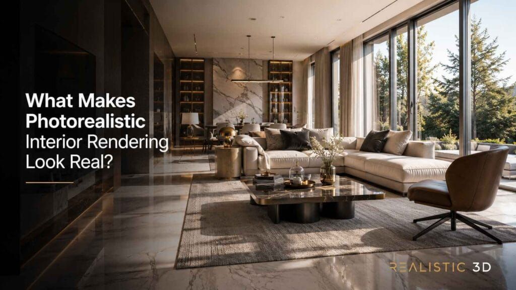
Photorealistic interior rendering looks real when scale, geometry, materials, light, camera, context, and colour all describe the same physical world. Extra detail cannot repair a contradiction between those cues. The image becomes believable when every visible decision supports the same room, time, lens, and material behaviour.
An 8K living-room image can still feel synthetic. The sofa is beautifully modelled, yet its feet barely touch the floor. Marble veins run across the worktop at furniture scale. Sunlight enters from the left while the curtain shadow falls right. A very wide lens makes the coffee table look longer than the sofa.
Beside it, a smaller image feels like a photograph. Its geometry is simpler. Its surface detail is quieter. What makes it convincing is agreement. The grout has a plausible size, timber responds differently from paint, the window drives the exposure, objects carry weight, and the camera stands where a photographer could stand.
That contrast reveals the central rule of photorealistic interior rendering. Realism is the absence of contradictions, not the maximum amount of detail.
This guide explains how professionals build that agreement, why technically polished images still look fake, how lighting and textures depend on each other, what resolution can and cannot change, and how to review an image without confusing beauty with design accuracy.
What does photorealism mean in an interior render?
Photorealism means that the visual evidence in an interior image behaves like evidence captured from a coherent physical scene. It does not mean that the image is automatically accurate to the design, suitable for construction, or impossible to distinguish from a photograph under every condition.
The word is often used as if it describes one sliding quality score. In practice, an image can succeed on one measure and fail on another.
| Quality | Main question | Typical evidence |
|---|---|---|
| Visual realism | Do the cues behave like one physical scene | Scale, light, material response, contact, reflection, camera, and colour agree |
| Design accuracy | Does the image follow approved information | Plans, schedules, product codes, model versions, and marked references match |
| Composition | Does the image direct attention well | Camera position, hierarchy, balance, crop, and visual rhythm serve the purpose |
| Resolution | Does the file contain enough pixels for delivery | Width, height, crop, print size, and channel specification are sufficient |
| Technical proof | Does a specialist study validate performance | A separate calculation, simulation, or compliance review supports the claim |
A polished image can be persuasive while showing the wrong chair. An accurate image can feel flat because the camera and lighting lack hierarchy. A huge file can preserve every synthetic error in greater detail.
For photorealistic interior rendering, these qualities must be named separately so a request for realism does not hide a specification, composition, or delivery problem.
That is why a useful photorealistic interior visualization brief names the purpose of the image. A design review, planning submission, investor presentation, property campaign, and furniture launch do not need the same balance of accuracy, atmosphere, and finish.
Is photorealism the same as design accuracy?
Photorealism and design accuracy are separate qualities. Photorealism concerns whether the image looks physically coherent. Design accuracy concerns whether it depicts the approved room, dimensions, products, finishes, and details.
Imagine a convincing hotel suite built from premium library furniture. The light is excellent and every fabric reads well. If the approved scheme specified different joinery, lamps, and upholstery, the image is visually strong but inaccurate.
The reverse also happens. A scene can use the correct model and product schedule yet feel synthetic because edges are infinitely sharp, texture scale drifts, indirect light is missing, or the camera stretches the room.
A realistic interior render should therefore be reviewed on two tracks.
- Visual review asks whether the physical cues agree
- Specification review asks whether the content matches current approved sources
- Communication review asks whether the image answers its intended audience question
The complete interior 3D rendering guide explains the broader production process. The guide to 3D rendering for interior design approvals covers source control, feedback, and sign-off in more depth.
Photorealistic interior rendering works best when these tracks meet. The artist needs enough design evidence to build the right room and enough visual judgment to make that room feel present.
Does higher resolution make a render more realistic?
Higher resolution does not make a render more realistic. It adds pixels, supports larger output, and can reveal finer detail, but it cannot correct scale, lighting, materials, reflections, geometry, or perspective.
There is no universal pixel count at which an image becomes photoreal. A 1600-pixel image can look convincing on a website. An 8000-pixel image can look artificial on the same screen.
Resolution should be specified from the final use.
| Use | Useful planning question |
|---|---|
| Website hero | What displayed width and high-density screen variant does the site require |
| Property portal | What dimensions, file size, and crop does the platform accept |
| Social campaign | Which portrait, square, and landscape ratios are needed |
| Presentation | What screen or projector resolution will display the image |
| What physical size and target pixels per inch does the printer require | |
| Large display | What viewing distance and display pixel dimensions apply |
For print planning, required pixel dimensions equal physical dimensions in inches multiplied by the requested pixels per inch. A 12 by 8 inch placement at 300 pixels per inch requires 3600 by 2400 pixels. The printer and campaign specification still control the final choice.
The sensible workflow approves camera, geometry, materials, and lighting at efficient preview sizes, then produces the contracted final output. Rendering every draft at full size wastes time without improving decisions.
Anyone asking how to make interior renders realistic should treat resolution as a delivery setting. Realism is built upstream.
Can one rendering engine guarantee realistic results?
No rendering engine can guarantee realistic results. Modern offline and real-time engines can simulate sophisticated light transport and material response, but the output still depends on geometry, input data, shading, sampling, camera choices, colour management, and artistic judgment.
Ray tracing follows paths between a camera, surfaces, and light sources. Path tracing estimates direct and indirect illumination through repeated samples. Rasterization can produce strong images through efficient approximations and hybrid techniques. Each approach has tradeoffs in speed, noise, bias, control, and supported effects.
The open Physically Based Rendering book documents how path tracing estimates direct and indirect light. The technical method matters, yet it does not decide whether a dining table has the right height or whether a fabric texture repeats every half metre.
Realistic 3D interior rendering also depends on where computation is spent. More samples can reduce noise. They do not repair a bad UV layout, impossible sun direction, missing wall thickness, or a camera placed inside furniture.
Choose software around workflow, team skill, required features, interoperability, schedule, output, and review needs. Judge the studio by controlled evidence across projects, not a renderer logo.
Can a render be indistinguishable from a photograph?
A render can be indistinguishable from a photograph for some viewers at a particular size, crop, and viewing duration. That does not create a universal test or a dependable guarantee.
Recognition changes with context. An architect may notice an impossible junction. A photographer may notice the lens and highlight rolloff. A furniture supplier may see the wrong seam. A casual viewer on a phone may see none of them.
The same image can pass at feed size and fail when enlarged. It can look convincing alone and reveal errors beside a site photograph. Connected views may expose a reflection, product, or window context that changes between cameras.
Photorealistic 3D visualization should aim for coherent evidence and truthful communication. It should not rely on fooling the viewer as its quality standard.
When an image represents an unbuilt proposal, label it clearly where confusion is likely. The US Federal Trade Commission guidance on truth in advertising and the UK advertising rules on misleading claims both reinforce the broader principle that visual marketing should not create a materially false impression.
What can a photorealistic image prove?
A photorealistic image can show an agreed visual interpretation of supplied design intent from a chosen camera and lighting state. By itself, it cannot prove construction feasibility, code compliance, exact installed colour, product availability, measured daylight, illuminance, acoustic performance, or the final workmanship.
This boundary protects both the client and the studio. The image is useful evidence, but it is evidence of a defined visual proposition.
| The image can help assess | The image does not prove |
|---|---|
| Visible scale relationships from the camera | Every dimension or clearance |
| Material combination and visual hierarchy | Exact appearance under all physical lighting |
| Furniture layout and spatial impression | Accessibility or code compliance |
| Proposed day or evening atmosphere | Measured daylight or illuminance performance |
| Product placement and visible features | Availability, lead time, or final substitution |
| Marketing composition | Completed construction or workmanship |
For dimensions, use the coordinated drawing or model. For lighting performance, use the relevant specialist calculation. For finish approval, keep physical samples and manufacturer data in the decision chain.
The role of photorealistic interior rendering is to make the visible proposal easier to understand before it exists. Its authority grows when its limits are explicit.
Which technical foundations make an interior render believable?
The technical foundations are correct scale, credible geometry, physically plausible material response, coherent direct and indirect light, a camera that could exist in the room, and a controlled colour pipeline. These systems must be developed together because each one changes how the others appear.
Studios often lose time polishing third-order details before resolving first-order contradictions.
| Error order | What it includes | Why it comes first or later |
|---|---|---|
| First order | Room scale, camera, major geometry, light direction, and exposure | These cues define the whole physical reading of the image |
| Second order | Material response, edge profiles, contact, reflections, asset quality, and context | These cues determine whether surfaces and objects belong in that world |
| Third order | Fibres, small wear, fingerprints, tiny props, dust, and micro variation | These cues can enrich a sound image but cannot rescue a broken one |
This hierarchy is the fastest answer to how to make interior renders realistic. Correct the room-wide contradiction before adding local detail.
Why does scale control every later realism decision?
Scale controls realism because geometry, texture size, light falloff, camera height, depth of field, furniture proportions, and perceived weight all depend on the scene using consistent physical dimensions.
A room imported in millimetres as metres can still be framed into an attractive picture. The hidden scale error appears elsewhere. Bevels become enormous or invisible. Brick and timber patterns use implausible dimensions. Photometric lights behave strangely. Camera depth of field no longer resembles a room-sized subject.
Start with known anchors.
- Confirm the unit system and one trusted room dimension
- Check door, worktop, seat, table, and ceiling heights against approved information
- Compare furniture bounding dimensions with manufacturer data
- Measure repeated materials such as tile, plank, panel, and grout
- Confirm thickness at glass, shelves, worktops, doors, cushions, and metal frames
A realistic interior render needs internal scale consistency even when exact specifications are unavailable. A representative chair should still relate plausibly to the table and the person implied by the space.
Scale also controls styling. A vase that is slightly large may feel deliberate. Ten objects with unrelated scale make a room feel like a collage.
Photorealistic interior rendering becomes stable when every later decision inherits one trusted measurement system.
For room-specific source and coverage needs, use the interior rendering services by room guide once it is live. The residential architectural rendering guide provides additional context for whole-home and property imagery.
How do geometry, bevels, and normals affect light?
Geometry affects realism by defining silhouette, thickness, contact, shadow, reflection, and the way highlights travel across an edge. Bevels and correct surface normals give the renderer enough form to describe those effects.
Real objects rarely end in mathematically perfect razor edges. Paint softens plaster corners. Timber has a routed or sanded edge. Stone carries a small arris. Upholstery compresses at seams and contact points.
The right bevel is not a universal modifier value. It follows the object, material, scale, manufacturing process, and distance from the camera. A worktop edge, metal frame, wall corner, ceramic basin, and cushion need different profiles.
Surface normals determine which direction the shader treats as outward. Broken or inconsistent normals can produce dark patches, inverted refraction, weak highlights, or shading that seems detached from the shape. Smoothing must preserve intended hard edges while allowing curved forms to read continuously.
Contact deserves a separate check. A sofa should compress or at least meet the floor cleanly. A cushion should respond to the chair beneath it. Joinery should connect at plausible seams. Curtains need attachment and gravity. Small gaps or intersections are among the first cues that turn a detailed asset into synthetic furniture.
Photorealistic interior visualization becomes much easier when the clay render already carries believable weight. If an untextured object floats, a premium material will make the error more visible.
What makes a material physically believable?
A material feels physically believable when its colour, reflectance, roughness, transmission, relief, scale, and variation describe the same substance under the scene lighting. A texture image alone is not a material.
In photorealistic interior rendering, surface credibility comes from the relationship between shader values, mapped detail, object form, and the light that reveals them.
Physically based rendering provides a consistent way to describe surface behaviour. The OpenPBR Surface specification defines a practical material model grounded in physical light transport. The open glTF material specification also documents a widely used metallic and roughness model.
| Channel or property | What it controls | Frequent failure |
|---|---|---|
| Base colour | Diffuse colour or metal reflectance input | Shadows and highlights baked into the map |
| Roughness | Width and clarity of reflected highlights | Every surface sharing the same gloss |
| Normal | Small directional changes without changing the main silhouette | Strength or feature size that exceeds the material |
| Displacement | Real surface relief that can affect silhouette and shadow | Deep relief applied to a nearly flat finish |
| Opacity | Cutout areas such as leaf or fabric patterns | Hard halos or incorrect edge filtering |
| Transmission | Light passing through glass, liquid, or thin material | Clear surfaces behaving like empty holes |
| Index of refraction | Bending and reflected proportion at a dielectric boundary | Arbitrary values chosen only for brightness |
| Coat or sheen | Layered finish response | A uniform glossy layer placed over every asset |
Physically based rendering materials are useful because they separate surface inputs from the lighting captured in a reference photo. Painting a bright window reflection into a timber base-colour map causes that highlight to remain when the camera or light moves.
PBR does not mean measured accuracy. A physically plausible shader can still use the wrong roughness, colour, texture scale, or layer structure. Start with manufacturer references and calibrated capture where exact appearance matters. Then review the shader under neutral light and the final scene light.
How should texture scale and variation be controlled?
Texture scale and variation should follow measured material dimensions, manufacturing logic, installation direction, object boundaries, and the camera distance. Variation should explain the surface rather than advertise the texture map.
Begin with repeat size. A 600 by 1200 millimetre tile should occupy that physical area in the scene. Timber plank width, fabric weave, stone slab extent, terrazzo aggregate, wall panel module, and grout width need the same discipline.
Then inspect mapping.
| Mapping question | What to check |
|---|---|
| Does the pattern have the right size | Compare one repeat with a trusted dimension in the model |
| Does the direction make sense | Follow grain, weave, slab, tile, and installation intent |
| Are seams visible where they should be | Match joints, panels, cushions, and slab breaks |
| Does repetition attract attention | Offset, rotate, or use controlled variants where the real product varies |
| Does relief match the feature | Keep normal and displacement depth proportionate to the physical surface |
| Does variation cross object boundaries badly | Prevent unrelated pieces from sharing an impossible continuous pattern |
Realistic material textures often fail because artists chase image resolution while ignoring physical repeat size. A 4K map of oversized fabric remains oversized.
Build realistic material textures from measured repeats, correct orientation, and material-specific response before adding decorative variation.
Natural variation also needs structure. Timber changes along grain. Stone veining belongs to a slab and may need bookmatching. Upholstery reacts to seams, tension, and cushion form. Brushed metal follows a finishing direction. Random noise applied everywhere creates visual dirt, not credibility.
A good rule is to vary what the material process would vary. Leave controlled products controlled.
How does global illumination shape an interior?
Global illumination makes an interior believable by accounting for light that reaches surfaces after bouncing from other surfaces. It creates soft fill, colour transfer, depth in corners, and the relationship between bright openings and darker room zones.
Direct light explains the first hit from a window, sun, pendant, or downlight. Indirect light explains much of what remains visible inside a room. Without it, ceilings may go dead, shadow zones become empty, and objects seem cut out against the floor.
Too much uncontrolled fill causes the opposite problem. If every corner is equally bright, the image loses direction, depth, and time of day. Good realistic interior lighting preserves a hierarchy between source, lit surfaces, bounce, and shadow.
Global illumination can be computed with several offline and real-time methods. The implementation matters less to the viewer than the final consistency. Epic Games documentation on Lumen explains one real-time approach to dynamic global illumination and reflections. The Cycles light-path documentation shows how another renderer exposes light transport controls.
Review lighting in layers.
- Start with daylight or the primary artificial source
- Check the direction and softness of the main shadows
- Add practical fixtures according to their visible role
- Evaluate bounce without flattening the room
- Inspect colour transfer near saturated walls, curtains, timber, and upholstery
- Confirm that reflective and transparent materials respond to the same environment
A bright render is not automatically well lit. A convincing render lets the viewer infer where the light came from and how it moved through the room.
Photorealistic interior rendering uses that readable light path to connect openings, fixtures, surfaces, shadows, and reflections.
What makes artificial lighting look credible?
Artificial lighting looks credible when each visible fixture has a plausible emission area, intensity, distribution, colour, location, and effect on nearby surfaces. The room should show a designed lighting hierarchy rather than a collection of glowing objects.
Use manufacturer photometric data when the fixture and distribution must be represented closely. IES files can describe how intensity varies by direction. They still need correct scale, orientation, units, exposure, and scene context.
Practical fixtures often fail in two ways. One setup makes the bulb or diffuser glow without illuminating anything. Another adds a hidden light that floods the room but has no visible or architectural motivation.
For believable results, separate what the fixture looks like from what its light does. A pendant shade may need a controlled emissive appearance, a physically meaningful light source, and local reflection or transmission. A downlight needs the correct beam direction and ceiling relationship. A concealed strip should reveal the surface it is designed to wash.
Realistic interior lighting does not require every source to dominate. Some fixtures are decorative. Some provide task light. Others shape walls or circulation. Their combined result should match the intended operating state.
This is also an evidence boundary. A beautiful evening image is not an illuminance calculation. If the project needs measured performance, glare analysis, emergency-lighting proof, or compliance, use the relevant specialist workflow.
How do camera position and focal length affect realism?
Camera position and focal length affect realism by controlling perspective, spatial compression, visible relationships, distortion, and whether the viewpoint feels physically possible. A lens can make accurate geometry look misleading.
Interior render camera settings should begin with purpose. A wide establishing view explains layout. A more focused editorial view communicates material or atmosphere. One camera rarely does both equally well.
Document interior render camera settings with the approved view so a later crop or revision does not silently change the spatial reading.
The Blender camera documentation provides a clear technical reference for focal length, sensor size, depth of field, clipping, and camera controls. The same photographic principles apply across tools even when interfaces differ.
Check these choices before final rendering.
| Camera choice | Diagnostic question |
|---|---|
| Position | Could a photographer or viewer plausibly stand here |
| Height | Does the view suit the room and audience rather than defaulting to one level |
| Focal length | Are near objects stretched or distant objects compressed beyond the intended reading |
| Vertical alignment | Should architectural verticals remain controlled for this image |
| Crop | Does the frame cut furniture, lights, or openings awkwardly |
| Depth of field | Does blur support attention without hiding required design information |
| Exterior context | Does the window view agree with camera direction, height, and exposure |
Very wide cameras are tempting in compact rooms. They show more, but they enlarge foreground objects and pull the background away. If the campaign needs honest spatial communication, compare the image with the plan and test whether a second camera communicates the missing area better.
Photorealistic 3D visualization borrows photographic behaviour without copying every camera defect. Chromatic aberration, lens bloom, vignetting, and blur should be subtle and motivated. A pile of camera effects often signals CGI more strongly.
Why does colour management matter?
Colour management matters because renders are calculated, viewed, adjusted, exported, and displayed through different colour spaces and devices. Without a controlled transform, highlights clip, shadows crush, saturation shifts, and team members may approve different-looking images.
Rendering is usually calculated in a scene-linear space that can contain values beyond a standard display. A view transform maps that range into an image a monitor can show. The working space, display transform, export profile, and delivery format must be intentional.
The ACES documentation explains a widely used colour-management system. OpenColorIO provides an open framework for consistent colour transforms across content-creation tools. ICC profile guidance covers device and colour-profile foundations.
The practical controls are straightforward.
- Agree on a colour-managed working pipeline
- Use the intended view transform during reviews
- Check exposure before relying on local corrections
- Export into the agreed delivery colour space
- Embed the appropriate profile where the format supports it
- Review critical images on a suitable, profiled display in controlled conditions
- Test representative files in the actual website, presentation, or print workflow
No digital pipeline guarantees that a fabric, paint, stone, or timber will look identical on every screen or in the built room. Displays differ. Ambient light changes perception. Physical materials change with angle and illumination.
Photorealistic interior rendering needs this managed pipeline because a strong scene can still fail when highlight detail or colour relationships are lost during export.
The goal is repeatable interpretation, not a promise that every device will show the same colour.
Why do technically polished interior renders still look fake?
Technically polished interior renders still look fake when one or more visible cues contradict the scene. The usual causes are wrong scale, perfect edges, uniform roughness, weak contact, unmotivated light, distorted perspective, broken reflections, aggressive denoising, or post-production that hides rather than solves the source problem.
Photorealistic interior rendering improves fastest when the team identifies the first contradiction and tests its source instead of applying general polish.
Viewers may not name the error. They simply feel that the image is off. Human vision is good at combining small cues about weight, surface, distance, and light. One conspicuous contradiction can outweigh hundreds of correct details.
This is why the production team should diagnose symptoms instead of adding general polish.
| Visible symptom | Likely cause | First test | Useful correction |
|---|---|---|---|
| Furniture appears to float | Weak contact, object gap, or excessive fill | Inspect a clay view at floor level | Correct placement and restore local shadow or compression |
| Timber looks like plastic | Uniform roughness, weak grain scale, or coated response | Compare highlight width with a real sample | Rebuild roughness and grain at physical scale |
| Marble looks tiled | Small source image or repeated UV pattern | View the whole slab without lighting | Use slab-scale mapping and planned variation |
| Walls seem to glow | Ambient fill, emissive material, or exposure imbalance | Isolate all light groups | Remove the false contribution and rebuild the hierarchy |
| Windows turn white or black | Missing context or unmanaged dynamic range | Review room and exterior exposure separately | Add credible context and balance the display transform |
| Room looks stretched | Camera too wide or too close to foreground objects | Compare visible proportions with the plan | Move the camera and use a less extreme field of view |
| Fabric looks stamped on | Flat mapping, repeated weave, or no form response | Inspect tangency, seams, and grazing highlights | Correct UVs, relief, roughness, and cushion geometry |
| Reflections feel unrelated | Missing environment, hidden geometry, or incorrect normals | Trace each major reflection to a source | Repair the reflected scene and surface orientation |
| Details look smeared | Aggressive denoising or enlargement | Compare the raw render, denoised output, and final crop | Improve sampling and reduce destructive processing |
| Image feels like a showroom set | Repeated asset spacing and no use logic | Remove decor and review circulation | Rebuild styling around occupants and room function |
An interior render quality checklist should begin with the largest contradiction visible at normal viewing size. Zooming to 400 percent encourages the team to repair pixels while the room-wide error remains.
Why does perfect uniformity feel artificial?
Perfect uniformity feels artificial because real materials, manufactured parts, installation, gravity, use, and light introduce structured variation. The key word is structured. Random dirt is no more truthful than perfect cleanliness.
Consider a painted wall. The broad finish may be even, but grazing light reveals slight texture. At a corner, the highlight follows a softened edge. Near a window, the wall receives a different balance of direct and reflected light. The material does not need stains to look real.
Furniture also carries variation through construction. Cushions compress. Upholstery follows seams and tension. Timber parts have related but nonidentical grain. Metal frames meet at joints. Books and tableware align with gravity and use.
Realistic material textures support those causes. They should not scatter scratches, fingerprints, and colour noise across every surface at the same strength.
Use three questions before adding imperfection.
- What physical process created this variation
- Where would that process affect the object
- Would the camera and light reveal it at this distance
If the team cannot answer, the detail may be decoration rather than evidence.
Photorealistic interior rendering often improves when artists remove generic grunge and spend that time on edge geometry, contact, seams, and material response.
Why do materials look plastic, flat, or repeated?
Materials look plastic, flat, or repeated when colour is doing all the work while roughness, relief, scale, mapping, and geometry provide little supporting information. The failure becomes obvious in highlights and at grazing angles.
Plastic-looking timber commonly has one gloss value across grain, pores, coating, and wear. Flat stone may use a beautiful colour photograph with no slab logic or relief. Repeated fabric may contain a clear motif that appears at identical intervals across several cushions.
Physically based rendering materials need distinct responses for distinct substances. Painted plaster, lacquer, brushed metal, unfinished timber, polished stone, linen, velvet, leather, and glass should not return the same highlight with different colours.
The artist should study reference images under several lighting conditions. A front-lit product photo shows colour. A grazing highlight reveals roughness and relief. A silhouette or edge view reveals thickness. A backlit view can expose transmission.
When exact products matter, collect manufacturer data, physical measurements, close photographs, and sample references. When the material is representative, record the assumptions so clients do not read a generic shader as a product guarantee.
A realistic interior render is easier to trust when its finish status is clear. Use labels such as exact selected product, representative match, design intent, or artist-selected placeholder in the review record.
How can a wide camera make an accurate room look false?
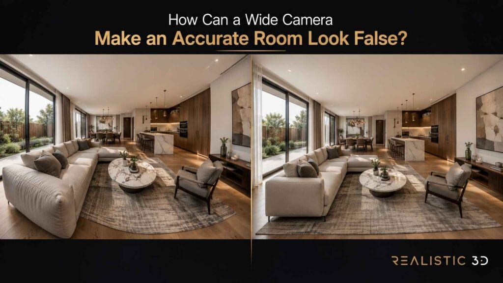
A wide camera can make an accurate room look false by exaggerating foreground scale, stretching objects near the frame edge, and making the background seem farther away. The model may be dimensionally correct while the image creates a misleading spatial impression.
The problem is strongest when the camera sits close to a bed, sofa, island, or table and tries to capture the entire room. Moving the camera slightly, choosing a more moderate field of view, or using two purposeful views often communicates the design better.
Interior render camera settings should follow the audience question.
| Audience need | Camera response |
|---|---|
| Understand the whole layout | Use a plausible standing viewpoint and enough width to explain relationships |
| Judge a material feature | Move closer and use a focused crop with controlled perspective |
| Market a compact property | Show value without stretching the room beyond a credible reading |
| Review joinery | Align the view so doors, panels, edges, and hardware remain legible |
| Communicate atmosphere | Use composition and light while preserving recognizable scale anchors |
Vertical convergence is another choice. Architectural imagery often keeps vertical lines controlled. A tilted camera can be appropriate, but accidental convergence makes the room feel unstable.
Depth of field should also follow camera scale and purpose. Heavy blur on a wide room view can resemble a miniature photograph and hide information that the audience needs.
Anyone studying how to make interior renders realistic should compare the camera against the plan, eye height, and real photographic references before refining materials.
Why do unmotivated lights weaken realism?
Unmotivated lights weaken realism because highlights, shadows, reflections, and exposure no longer lead back to believable sources. The room may look attractive, yet the viewer cannot understand its time, orientation, or lighting design.
Common symptoms include a ceiling that is brighter than every source could make it, window light from two opposing directions, downlights without pools or beam shape, glowing shades with no local effect, and bright reflective edges facing darkness.
Realistic interior lighting needs a readable hierarchy.
- Establish the daylight, sun, or main artificial state
- Add architectural and practical fixtures with specific roles
- Preserve indirect fill that belongs to those sources
- Check the balance through material highlights and reflections
- Adjust exposure and tone mapping after the light logic works
The sequence matters. Exposure can brighten a dark room, but it also lifts every contribution. Hidden fill can rescue one corner while flattening the entire scene.
Test sources alone and in logical groups. A daylight-only view reveals opening direction and bounce. A practical-only view reveals fixture contribution. The combined view should feel like the sum of the same physical setup.
Photorealistic interior visualization benefits from restraint. Dark areas may remain dark if they preserve depth and still carry enough readable information for the image purpose.
Why do reflections reveal hidden scene errors?
Reflections reveal hidden errors because they show geometry, lights, openings, and context outside the direct camera view. A room can look correct in its visible surfaces while a mirror, window, metal edge, or polished floor exposes the incomplete scene.
A bathroom mirror may reveal a missing wall or camera. A glass partition may reflect an exterior image that does not match the window direction. A polished worktop may show a large hidden light with no architectural source. Metal may reflect a black void because the surrounding environment was never built.
Do not weaken every reflection to conceal these problems. Roughness should follow the material, not the inconvenience of the scene.
Use reflection tracing during review.
- Identify the source of each major highlight
- Check that mirrors reflect the correct opposite geometry
- Confirm that glass has thickness, plausible edges, and the intended surrounding medium
- Inspect polished surfaces for missing ceilings, walls, lights, and window context
- Compare connected views so reflected products and openings remain consistent
Photorealistic 3D visualization becomes stronger when the scene is complete enough for its reflective materials. A single still does not always need a full building, but it needs the physical evidence visible from that camera.
Can denoising and post-production repair a weak render?
Denoising and post-production can refine a sound render, but they cannot reliably repair wrong geometry, implausible material scale, broken light transport, or deceptive perspective. They work best as controlled finishing stages with clear before-and-after review.
Path-traced images contain statistical noise when the sample estimate has not converged. More samples, better sampling, sensible light paths, and scene optimization can reduce it. Denoising estimates a cleaner image from the noisy result and may use colour, albedo, and normal information to preserve structure.
The Intel Open Image Denoise documentation explains the use of auxiliary feature images and warns through its workflow requirements that inputs must be prepared correctly. Denoising is an image reconstruction step, not a substitute for scene quality.
Aggressive denoising may soften timber pores, fabric weave, thin edges, reflected detail, and small lights. It can create patches that look painted. Always compare the raw render, denoised output, and final delivery crop.
Post-production is valuable for compositing render passes, balancing local contrast, managing colour, integrating licensed background elements, and preparing channel-specific crops. It becomes risky when every surface receives extra sharpening, every light receives bloom, and saturation replaces material response.
Realistic 3D interior rendering should survive a comparison between the render and the composite. The final grade may direct attention, but the room should remain the same physical scene.
When does added imperfection become visual noise?
Imperfection becomes visual noise when it has no connection to material, manufacturing, installation, age, use, camera distance, or story. If every object is scratched, dusty, wrinkled, tilted, and colour-shifted, the image looks processed rather than lived in.
Use imperfection with purpose.
| Surface or object | Plausible source of variation | Weak shortcut |
|---|---|---|
| Stone | Slab veining, pores, finish, edge profile, and joint layout | Random scratches over the whole material |
| Timber | Grain direction, board variation, coating, joinery, and end grain | Colour noise unrelated to boards |
| Fabric | Weave, seams, tension, pile, folds, and compression | Strong bump at every viewing distance |
| Metal | Brushing direction, machining, coating, fingerprints in touched zones | Uniform grunge over protected areas |
| Painted wall | Fine texture, edge softness, slight application variation, and grazing response | Large blotches added to force detail |
| Styling | Use, gravity, access, and occupant habits | Random rotation of every prop |
Start from the designed condition. A new luxury apartment, family kitchen, heritage hotel, and industrial café have different material histories. Variation reads as credible only when it fits that history and the declared state of the space.
An interior render quality checklist should ask whether each visible irregularity carries information. If it does not, remove it.
Can generative AI improve realism without changing the design?
Generative AI can improve some local image qualities, but it may also change geometry, products, patterns, text, reflections, openings, and consistency between views. It should be treated as a controlled image operation, not as verified design evidence.
For photorealistic 3D visualization, every AI-assisted output should remain traceable to the approved scene and reviewed at the level of design content.
AI-assisted denoising, masking, selection, upscaling, and cleanup can save production time when outputs are compared against the source scene. Generative relighting or enhancement carries greater design risk because the model may invent plausible-looking content.
A single enhanced image can hide the change. A second view often exposes it. Joinery widths shift, chair details mutate, stone veining changes, lights move, and window context no longer aligns.
Use an AI control record for approval imagery.
- Keep the pre-AI render and versioned source scene
- Identify which areas and operations used AI
- Compare silhouettes, openings, furniture, products, materials, and text
- Check reflections and connected views
- Prevent generated detail from being read as an approved specification
- Obtain the rights and permissions required for inputs and outputs
Photorealistic interior rendering remains accountable to the brief. If an enhancement changes the design, it is a new interpretation that requires review.
How should professionals review and improve interior realism?
Professionals should review interior realism in a fixed order that separates reference accuracy, geometry, materials, light, camera, colour, and output. Layered checks expose the source of an error faster than one broad request to make the image more realistic.
Photorealistic interior rendering benefits from this sequence because each approval confirms one layer before later work makes the scene harder to diagnose.
The Realistic 3D approach uses the REALISM framework. It turns a subjective reaction into seven reviewable questions.
| Letter | Review layer | Practitioner question |
|---|---|---|
| R | Reference accuracy | Are dimensions, products, finishes, and source versions reliable |
| E | Edges and geometry | Do thickness, profiles, joins, normals, seams, and contact behave correctly |
| A | Assets and material response | Are models, mapping, roughness, relief, and optical properties believable |
| L | Light logic | Does every major highlight, shadow, reflection, and exposure choice have a plausible source |
| I | Imperfection with purpose | Does variation follow material, making, installation, age, and use |
| S | Sightline and sensor | Do position, focal length, height, focus, verticals, and crop describe the room honestly |
| M | Managed colour and output | Is the image reviewed and delivered through a controlled colour and channel pipeline |
This interior render quality checklist creates information gain for both the studio and the client. It replaces vague taste language with evidence that can be marked, corrected, and approved.
What is the REALISM quality framework?
The REALISM quality framework is a seven-layer diagnostic method for checking whether an interior image is visually coherent and faithful to its declared sources. Teams move through the letters in order and resolve high-impact contradictions before polishing microdetail.
R checks the input truth. A beautiful wrong product is still wrong.
E checks whether the room and objects have physical form. This includes silhouette, edge profile, thickness, joins, gravity, and contact.
A checks the behaviour of assets and surfaces under light. It covers scale, mapping, roughness, transmission, relief, and variation.
L checks the cause of every major lighting event. It includes daylight, fixtures, bounce, shadow, reflection, exposure, and time of day.
I checks whether imperfection belongs. The framework rewards material-specific evidence, not generic dirt.
S checks the virtual sensor. Interior render camera settings must explain the room without unintended stretching, unstable verticals, or decorative blur.
M checks the route from scene-linear data to the delivered image. It includes view transforms, grading, profiles, compression, crops, and target platforms.
Run the framework again after major revisions. A changed material affects light. A moved camera reveals new geometry. A new crop may expose a denoising artifact that was invisible before.
Why should quality checks begin with a clay render?
Quality checks should begin with a clay render because neutral materials expose scale, silhouette, camera, edge geometry, contact, and major light direction without decorative textures hiding the problem.
A clay view is not an unfinished image sent without purpose. It is a focused diagnostic stage.
Review the following evidence.
| Clay-view check | What it can reveal |
|---|---|
| Room proportions | Wrong units, levels, ceiling heights, openings, and connected spaces |
| Camera | Implausible placement, excessive width, crop, and vertical convergence |
| Silhouette | Weak asset shape, paper-thin elements, and missing construction depth |
| Edges | Razor corners, excessive bevels, and inconsistent smoothing |
| Contact | Floating furniture, intersections, gaps, and missing compression |
| Main lighting | Source direction, shadow softness, hierarchy, and exposure balance |
Do not use a highly glossy clay shader that turns the stage into a material test. A neutral response with readable highlights and shadows works better.
Once the clay image is sound, add physically based rendering materials in controlled groups. Large architectural surfaces usually come first, followed by fixed elements, furniture, textiles, glass, and styling.
This staged method helps teams learning how to make interior renders realistic because each review has a defined question.
Which render passes help diagnose realism problems?
Render passes help diagnose realism problems by isolating information that the beauty image combines. Useful passes include diffuse or albedo, direct and indirect light, specular response, normals, depth, object masks, cryptomatte data, and denoising features.
The exact names differ by renderer. The review purpose remains stable.
| Pass or view | Diagnostic use |
|---|---|
| Albedo or base colour | Detect baked light, wrong colour values, and material separation |
| Direct light | Check primary sources, fixture roles, shadow direction, and intensity |
| Indirect light | Check bounce, colour transfer, dark zones, and excessive fill |
| Specular | Inspect roughness, reflection shape, edge highlights, and hidden sources |
| Normal | Find broken orientation, smoothing errors, and denoising guidance issues |
| Depth | Review atmospheric effects, focus, masking, and distance relationships |
| Object or material masks | Apply controlled corrections without broad destructive edits |
| Raw and denoised comparison | Find lost texture, smeared reflection, halos, and softened edges |
Passes are not an invitation to rebuild every physical decision in compositing. They help locate the problem and decide whether it belongs in the scene, renderer, or final grade.
Realistic material textures should remain identifiable across the raw beauty render, diagnostic passes, denoised image, and final grade.
A realistic interior render should also be reviewed as a complete image at normal display size. Pass analysis can become too local if the team forgets composition and hierarchy.
How should references be compared without copying them?
References should be compared by extracting observable properties such as scale, edge behaviour, roughness, light direction, highlight shape, colour relationships, lens perspective, and material construction. The goal is to understand the cause, not copy a copyrighted composition or unrelated design.
Build a reference board with labels.
- Exact references identify the selected product, finish, room, or view requirement
- Behaviour references show how a similar material responds to light
- Mood references guide atmosphere, contrast, styling density, and colour balance
- Camera references explain viewpoint, height, compression, or crop
- Exclusion references show outcomes the client does not want
Photorealistic interior visualization needs this separation. A mood image may show a warm oak wall, but it does not automatically authorize that species, panel size, or joinery detail.
Keep rights in mind. Use reference images for analysis and direction under appropriate permissions. Use original, licensed, or client-authorized assets in final marketing work.
The Realistic 3D photo gallery can demonstrate delivered visual standards. The architectural 3D rendering explainer provides broader context for the role of architectural images.
What production stages create reliable quality control?
Reliable quality control uses staged approvals that expose different error types before final resolution. Each stage should have a named output, a review question, and one consolidated response.
| Stage | Review focus | Approval question |
|---|---|---|
| Source audit | Files, versions, dimensions, products, finishes, and assumptions | Is the visual brief complete enough to begin |
| Clay and camera | Geometry, scale, contact, views, crop, and main light | Does the image show the right room honestly |
| Material draft | Mapping, scale, roughness, relief, products, and substitutions | Do visible surfaces match their declared status |
| Lighting draft | Source logic, bounce, fixtures, exposure, and atmosphere | Does the light state support the design and image purpose |
| Quality preview | Sampling, reflection, glass, edge detail, context, and consistency | Are remaining issues local rather than structural |
| High-resolution render | Noise, denoising, microdetail, crop safety, and render integrity | Is the source image clean enough for finishing |
| Composite proof | Grade, integration, local balance, and restraint | Has finishing improved the image without changing approved content |
| Output proof | Size, ratio, profile, compression, filename, and channel test | Is the final file correct for its named use |
Realistic 3D interior rendering becomes predictable when changes are caught at the stage where they are least expensive to solve. Moving a camera after final retouching may reveal unbuilt scene areas and invalidate local edits.
The Realistic 3D interior rendering service is the right destination for buyers who have moved from technical education into project scoping. This article keeps the quality criteria visible so the conversation can start with evidence.
When is an interior render ready for final delivery?
An interior render is ready for final delivery when it passes visual, specification, technical, and output checks at the intended viewing size and channel. Approval should identify the file version and declared use.
Use a final gate.
- Scale and camera remain plausible against approved information
- Visible products and finishes match their stated exact or representative status
- Edges, contacts, seams, reflections, and transparent materials survive close review
- Lighting has a coherent source hierarchy and agreed atmosphere
- Noise and denoising artifacts are acceptable at delivery size
- Post-production has not changed geometry or approved content
- Colour space, profile, dimensions, ratio, format, and compression match delivery requirements
- CGI labelling and usage rights are resolved
The image should also agree with other views. Check product variants, door positions, lighting state, exterior context, art, props, material direction, and reflections across the set.
Photorealistic interior rendering is ready when another informed reviewer can trace what the image shows, which sources governed it, what remains illustrative, and where it will be used.
What should clients inspect before approving image quality?
Clients should inspect the room-wide physical cues first, then specification details, then final polish. Begin with scale, camera, light direction, major materials, product identity, and connected-view consistency.
Use the same interior render quality checklist at every formal review. Changing the criteria late makes feedback subjective and hard to close.
Clients do not need to diagnose every shader setting. They can report evidence clearly.
| Weak comment | Stronger evidence-led comment |
|---|---|
| Make it more realistic | The sofa appears to float because the front feet do not meet the rug |
| The wood feels wrong | The grain is oversized and the highlight is too uniform for the selected matte oak |
| The lighting needs drama | Keep the window as the main source and reduce the ceiling fill so the seating retains depth |
| The room looks too small | Compare the camera width and foreground table distortion with the approved plan |
| The colours are off | Compare the export profile and approved sample reference on the agreed review display |
For broader buying questions, use the Realistic 3D FAQ. For commercial projects, the commercial architectural rendering guide helps connect image quality with public, workplace, retail, and hospitality use.
The best approval comment identifies the object, visible symptom, governing source, and desired correction.
What do designers and architects ask about interior photorealism?
Designers and architects most often ask what photorealism means, why materials look fake, whether lighting outranks textures, which resolution or software is required, and whether CGI can pass as photography. The answers below separate visual quality from technical and design proof.
What is photorealistic interior rendering?
Photorealistic interior rendering is the creation of a digital interior image whose geometry, materials, lighting, camera, and colour behave like a coherent physical scene. It may depict a space before construction, a proposed refurbishment, or a controlled alternative to photography.
The term describes visual credibility, not automatic design accuracy or compliance. Strong photorealistic interior rendering combines approved information with physically plausible image making and clear assumptions. It should be labelled as CGI when the context could lead viewers to mistake an unbuilt proposal for completed work.
How do you make an interior render look realistic?
Make an interior render look realistic by fixing contradictions in order. Confirm scene scale and camera first. Build believable geometry, edges, thickness, seams, and contact. Use physically based rendering materials with correct map scale and response.
Establish realistic interior lighting through motivated sources and indirect bounce. Manage exposure and colour. Add only material-specific variation. Then review raw, denoised, and final outputs. This sequence is a practical answer to how to make interior renders realistic because it prevents microdetail from hiding a room-wide error.
Why do some interior renders look fake?
Interior renders look fake when visual cues disagree. Common causes include stretched perspective, oversized textures, uniform gloss, razor edges, floating furniture, missing reflections, flat ambient fill, impossible shadows, repeated assets, and excessive post-production.
A realistic interior render does not need visible dirt everywhere. It needs scale, weight, light, and material response that belong to the same scene. Diagnose the largest symptom at normal viewing size, isolate the likely system, and correct the source before increasing samples or output resolution.
Is lighting more important than textures?
Lighting is not universally more important than textures because the two systems define each other. Light reveals roughness, relief, colour, and edge form. Material properties determine how much light is absorbed, reflected, scattered, or transmitted. Geometry and camera provide the evidence both depend on.
Realistic interior lighting cannot make an oversized fabric weave correct, and realistic material textures cannot rescue impossible light direction. Establish scale and light logic early, then develop material response under representative lighting and review both together.
What are PBR materials in interior rendering?
PBR materials are shaders designed to represent physically plausible surface responses through properties such as base colour, roughness, metallic behaviour, normals, displacement, transmission, and index of refraction.
Physically based rendering materials improve consistency across light and camera changes, but the label does not guarantee accuracy. Values, map scale, UV direction, geometry, layer structure, and references still matter. For photorealistic 3D visualization, PBR is a disciplined material framework rather than a one-click realism setting.
Can a 3D render be indistinguishable from a photograph?
A 3D render can be indistinguishable from a photograph for some viewers under a specific crop, size, context, and viewing time. It cannot be guaranteed for every expert, enlargement, comparison, or connected view.
A photorealistic interior visualization may pass at phone size and reveal a material, reflection, product, or camera error when inspected closely. The professional goal should be coherent and truthful communication. If the image depicts an unbuilt proposal, disclose its CGI status wherever omission could create a misleading impression.
What resolution makes an interior render photorealistic?
No resolution makes an interior render photorealistic. Pixel dimensions control how large the image can be displayed or printed and how much detail it can carry. They do not repair geometry, material response, lighting, camera perspective, or colour.
A realistic interior render should be approved at efficient preview sizes and delivered at dimensions selected for its website, listing, social, presentation, print, or display use. Specify width, height, ratio, format, colour profile, and compression instead of asking for a vague photoreal resolution.
Which software produces the most realistic interior renders?
No single software package automatically produces the most realistic interior renders. Many current offline and real-time tools support ray tracing, global illumination, physically based materials, photographic cameras, and managed colour.
Output quality depends on scene preparation, artist judgment, renderer configuration, references, review discipline, and time. When comparing providers, inspect several relevant projects, clay and draft stages, close material behaviour, connected-view consistency, and the studio quality process. Software is one part of realistic 3D interior rendering, not the quality guarantee.
Record the decisive interior render camera settings when comparing test images so software output is judged from equivalent viewpoints.
What should you take away about interior rendering realism?
The practical takeaway is simple. Fix contradictions before adding detail. Confirm scale, geometry, materials, light, camera, and colour in that order, then use imperfection only where the physical scene justifies it.
Photorealistic interior rendering succeeds when every visible cue belongs to the same world. The tile size fits the room. The sofa carries weight. The timber returns the right kind of highlight. Window light explains the shadow and reflection. The camera communicates space without stretching it. The colour pipeline preserves the intended balance through delivery.
Use the REALISM framework to review that evidence. Start with references and edges. Continue through assets, light, imperfection, sightline, and managed output. If the image still feels wrong, look for the first contradiction instead of asking for more detail.
Keep the interior render quality checklist beside the brief so every correction remains tied to a visible symptom and a governing source.
That discipline produces a polished picture with practical value. It creates a photorealistic interior visualization that designers, architects, marketers, and clients can understand, question, and use with confidence.
Done well, photorealistic interior rendering makes an unbuilt room legible without pretending that an image can replace specifications, specialist studies, physical samples, or the completed work.
